近年来 CSS 的那些新特性
本篇文章旨在收集近几年 CSS 新发布的一些特性。
伪元素 ::first-letter
伪元素 ::first-letter,作用于元素第一个字,比如下面这个首字突出显示的效果。
:::: tabs ::: tab HTML
<p>今天天气可真好啊!</p>
::: ::: tab CSS
p::first-letter {
  font-size: 30px;
  font-weight: bold;
}
::: ::: tab 效果 .jpg) ::: ::::
::: ::::
可变化字体
可变化字体相对于标准(静态)字体的区别是可以直接使用所有字重,宽度和样式的字体。
使用 font-variation-settings 设置字体样式,比如:
.element {
  font-variation-settings: 'wght' 375;
}
可变字体通过变化轴来定义他们的变化,一共 5 个标准轴:
ital:斜体轴,该轴只有两种状态,0 表示不倾斜,1 表示倾斜。wght:粗细轴,控制字体粗细度,值可以是 300-900 的任意整数,也可以使用font-weight设置。wdth:宽度轴,可以使用font-width设置。opsz:光学尺寸是指改变字体的光学尺寸的做法,可以使用font-optical-sizing设置该值。slnt:控制字体的倾斜度,可以使用font-style属性设置该值。它通过表示为数字范围而可变,这允许字体沿该轴的任何位置变化。
想体验下可变化字体的效果可以看 Variable Fonts。
inline-size 和 block-size
inline-size 影响一个元素的 width 和 height,而影响的是宽还是高取决于元素的 writing-mode。
:::: tabs ::: tab HTML
<div class="div1">
  This is Div1;This is Div1;This is Div1;This is Div1;This is Div1;This is Div1;
</div>
<div class="div2">
  This is Div2;This is Div2;This is Div2;This is Div2;This is Div2;This is Div2;
</div>
::: ::: tab CSS
div {
  margin: 2em;
}
.div1 {
  background-color: cornflowerblue;
  inline-size: 150px;
  writing-mode: horizontal-tb;
}
.div2 {
  inline-size: 150px;
  writing-mode: vertical-rl;
  background-color: cornflowerblue;
}
::: ::: tab 效果 .jpg) ::: ::::
::: ::::
block-size 同理受到 writing-mode 的影响:
:::: tabs ::: tab HTML
<div class="div1">
  This is Div1;This is Div1
</div>
<div class="div2">
  This is Div2;This is Div2
</div>
::: ::: tab CSS
div {
  margin: 1em;
}
.div1 {
  background-color: cornflowerblue;
  block-size: 150px;
  writing-mode: horizontal-tb;
}
.div2 {
  block-size: 150px;
  writing-mode: vertical-rl;
  background-color: cornflowerblue;
}
::: ::: tab 效果 .jpg) ::: ::::
::: ::::
可以说当 inline-size 控制宽度的时候,block-size 就控制的是高度,反之亦然。两者是相互配合的。
滚动捕捉
使用 scroll-snap-type 属性让用户在滚动完之后将市口锁定到某些元素或位置,可以想象一下轮播图的效果,这是展示图库的绝佳方式。
.container {
  scroll-behavior: smooth;
  overflow-x: auto;
  -webkit-overflow-scrolling: touch;
  scroll-snap-type: x mandatory;
  scroll-padding: 20px;
}
img {
  scroll-snap-align: center;
  scroll-snap-stop: always;
}
scroll-snap-type 设置 x mandatory 则为横向滚动时进行捕捉,而 y proximity 为纵向滚动时进行捕捉。设为 both mandatory 则为横纵滚动都捕捉。
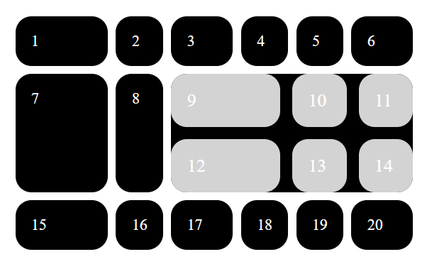
子网格
Notice
截至文章发布,该特性只在 FireFox 71 上实现。
对于 display: grid 的元素,只有它的直接子元素才会成为网格项,如果你想对子元素使用 display: grid 来实现网格嵌套会遇到一个困难:这两个网格是彼此独立的,很难将子网格项与父网格项对齐。
设置 grid-template-columns: subgrid 可以继承父网格的属性,与父网格对齐。
如图
使用 CSS 测试浏览器支持
@supports 可以指定依赖于浏览器中的一个或多个特定的 CSS 功能的支持声明。这被称为特性查询。该规则可以放在代码的顶层,也可以嵌套在任何其他条件组规则中。
/* 支持grid的时候执行 */
@supports (display: grid) {
  div {
    display: grid;
  }
}
/* 不支持grid的时候执行 */
@supports not (display: grid) {
  div {
    float: right;
  }
}
媒体查询 Level-4
@media (max-width: 30em) {
  ...;
}
在媒体查询级别 4 中,这可以写为:
@media (width <= 30em) {
  ...;
}
使用 min- 和 max- 我们可能会测试两个值之间的宽度,如下所示:
@media (min-width: 30em) and (max-width: 50em) {
  ...;
}
这将转换为 Level 4 语法:
@media (30em <= width <= 50em) {
  ...;
}
文字描边
使用 webkit-text-stroke 对文字进行描边。
Notice
该特性目前只支持 WebKit 内核。
:::: tabs ::: tab HTML
<h1>This is text stroke</h1>
::: ::: tab CSS
h1 {
  -webkit-text-fill-color: blue;
  -webkit-text-stroke: 2px #000;
}
::: ::: tab 效果 .jpg) ::: ::::
::: ::::
渐变文字
:::: tabs ::: tab HTML
<h1>This is text stroke</h1>
::: ::: tab CSS
h1 {
  background: linear-gradient(60deg, red, yellow, red, yellow, red);
  -webkit-background-clip: text;
  -webkit-text-fill-color: transparent;
}
::: ::: tab 效果 .jpg) ::: ::::
::: ::::
line-clamp
该属性允许的内容限制块容器到指定的行数。
:::: tabs ::: tab HTML
<p>
  In this example the <code> -webkit-line-clamp </code> property is set to <code>3</code>, which means the text is
  clamped after three lines. An ellipsis will be shown at the point where the text is clamped.
</p>
::: ::: tab CSS
p {
  width: 300px;
  display: -webkit-box;
  -webkit-box-orient: vertical;
  -webkit-line-clamp: 3;
  overflow: hidden;
}
::: ::: tab 效果 .jpg) ::: ::::
::: ::::
虽然该属性带有 -webkit- 前缀,但 FireFox 也完全支持!
column-count
该 CSS 属性分割元素的内容到指定的列数。
:::: tabs ::: tab HTML
<p>
  London. Michaelmas term lately over, and the Lord Chancellor sitting in Lincoln's Inn Hall. Implacable November
  weather. As much mud in the streets as if the waters had but newly retired from the face of the earth, and it would
  not be wonderful to meet a Megalosaurus, forty feet long or so, waddling like an elephantine lizard up Holborn Hill.
</p>
::: ::: tab CSS
p {
  column-count: 3;
}
::: ::: tab 效果 .jpg) ::: ::::
::: ::::
字符单位 ch
1ch 表示一个字符 0 的宽度,也会随着字体样式的变化而变化。
:::: tabs ::: tab HTML
<div>0000000000000000000000</div>
::: ::: tab CSS
div {
  width: 10ch;
  height: 200px;
  word-break: break-all;
}
::: ::: tab 效果 .jpg) ::: ::::
::: ::::
object-fit
该属性指定元素的内容应该如何适应到其定义的宽和高。一般用于展示图片。
object-fit 有五个值:
none:指定元素将保持其原有的尺寸。contain:指定元素将被缩放,以在填充元素的内容框时保持其宽高比。 整个对象在填充盒子的同时保留其长宽比,因此如果宽高比与框的宽高比不匹配,该对象将被添加黑色背景。cover:指定元素在保持其宽高比的同时填充元素的整个内容框。如果对象的宽高比与内容框不相匹配,该对象将被剪裁以适应内容框。fill:被替换的内容正好填充元素的内容框。整个对象将完全填充此框。如果对象的宽高比与内容框不相匹配,那么该对象将被拉伸以适应内容框。scale-down:内容的尺寸与none或contain中的一个相同,取决于它们两个之间谁得到的对象尺寸会更小一些。
具体效果请看:object-fit-MDN
conic-gradient
锥形渐变 conic-gradient 可以轻松的画出简单的饼图:
:::: tabs ::: tab HTML
<div class="piechart"></div>
::: ::: tab CSS
.piechart {
  background: conic-gradient(rgb(255, 132, 45) 0% 25%, rgb(166, 195, 209) 25% 56%, #ffb50d 56% 100%);
  border-radius: 50%;
  width: 300px;
  height: 300px;
}
::: ::: tab 效果 .jpg) ::: ::::
::: ::::
查看锥形渐变的更多应用,请看 CSS conic-gradient()锥形渐变简介
counter()
这是一个 CSS 函数,返回一个代表计数器当前值的字符串,通常和伪元素搭配使用,其实可以在支持字符串值的任何地方使用。
该函数涉及到几个样式属性:
counter-reset:属性设置一个计数器,可以理解为声明一个计数器变量。counter-increment:属性增加计数器的值。
:::: tabs ::: tab HTML
<ul>
  <li></li>
  <li></li>
  <li></li>
</ul>
::: ::: tab CSS
ul {
  counter-reset: li-number;
}
li {
  counter-increment: li-number;
}
li::after {
  content: 'This is ' counter(li-number) 'th li element';
}
::: ::: tab 效果 .jpg) ::: ::::
::: ::::
伪元素 ::selection
::selection 伪元素应用于文档中被用户选中的部分。
::selection {
  background-color: cyan;
}
并不是所有属性都支持 ::selection,允许属性请看 允许属性-MDN
aspect-ratio
aspect-ratio 可以实现容器等比缩放的效果。
假如你想让 img 呈现 16:9 的显示效果,可以:
img {
  width: 400px;
  aspect-ratio: 16/9;
}
这样就可以生成一个宽为 400px,并且比例为 16:9 的图片了。
很多网站的图片和视频都是用这种方式来实现屏幕自适应。
伪类 :dir()
伪类 :dir() 匹配特定文字书写方向的元素。除了我们熟悉的从左到右(ltr)之外,阿拉伯语和希伯来语等语言是从右到左(rtl)书写的,因此在做国际化的时候要考虑到这一点。
:::: tabs ::: tab HTML
<div dir="rtl">
  <span>test1</span>
  <div dir="ltr">
    test2
    <div dir="auto">עִבְרִית</div>
  </div>
</div>
::: ::: tab CSS
:dir(rtl) {
  background: red;
  color: #fff;
}
::: ::::
Notice
截至本文章发布,该特性只在 FireFox 上支持。
prefers-color-scheme
prefers-color-scheme 用于检测用户是否将系统的主题颜色设置为亮色或者暗色。
可以通过这个特性配合媒体查询来实现主题转换:
:root {
  /* Light theme */
  --c-text: #333;
  --c-background: #fff;
}
body {
  color: var(--c-text);
  background-color: var(--c-background);
}
@media (prefers-color-scheme: dark) {
  :root {
    /* Dark theme */
    --c-text: #fff;
    --c-background: #333;
  }
}
prefers-reduced-motion
prefers-reduced-motion 用于检测用户的系统是否被开启了动画减弱功能
.animation {
  animation: vibrate 0.3s linear infinite both;
}

@media (prefers-reduced-motion: reduce) {
  .animation {
    animation: none;
  }
}
比较函数
CSS 有三个比较函数:min,max 和 clamp。这些函数接收多个值或表达式,他们会对值进行比较,然后返回合适的结果。
min:函数会从多个参数(或表达式)中返回一个最小值作为 CSS 属性的值,即使用min()设置最大值,等同于max-width。max:函数会从多个参数(或表达式)中返回一个最大值作为 CSS 属性的值,即使用max()设置最小值,等同于min-width。clamp:clamp()和min()以及max()略有不同,它将返回一个区间值,即在定义的最小值和最大值之间的数值范围内的一个中间值。该函数接受三个参数:- 最小值(
MIN) - 中间值(
VAL),也称首选值 - 最大值(
MAX)
- 最小值(
clamp 的比较规则如下:
- 如果
VAL在MIN和MAX之间,则使用VAL作为函数的返回值 - 如果
VAL大于MAX,则使用MAX作为函数的返回值 - 如果
VAL小于MIN,则使用MIN作为函数的返回值
fit-content
fit-content 用于设置元素的宽度,它相当于:
h1 {
  width: fit-content;
}

/* 等同于 */
h1 {
  width: auto;
  min-width: min-content;
  max-width: max-content;
}
fit-content 的取值逻辑如下:
- 如果元素的可用空间充足,
fit-content将使 用max-content。 - 如果元素的可用空间不够充足,比
max-content小点,那就是用可用空间的值,不会导致内容溢出。 - 如果元素的可用空间很小,比
min-content还小,那就使用min-content。
Notice
min-content 表示元素内容固有的最小宽度。max-content 表示元素内容固有的合适宽度。
:::: tabs ::: tab HTML
<nav>
  <h2>👎 list is max-content</h2>
  <ul>
    <li><a href="#0">One</a></li>
    <li><a href="#0">Two</a></li>
    <li><a href="#0">Little longer link</a></li>
  </ul>
</nav>
<nav>
  <h2>👎 list is min-content</h2>
  <ul>
    <li><a href="#0">One</a></li>
    <li><a href="#0">Two</a></li>
    <li><a href="#0">Little longer link</a></li>
  </ul>
</nav>
<nav>
  <h2>👍 list is fit-content</h2>
  <ul>
    <li><a href="#0">One</a></li>
    <li><a href="#0">Two</a></li>
    <li><a href="#0">Little longer link</a></li>
  </ul>
</nav>
::: ::: tab SCSS
nav {
  border: 1px solid gray;
  margin: 0 0 1rem 0;
  padding: 2rem;
}
ul {
  width: max-content;
  nav:nth-child(2) & {
    width: min-content;
  }
  nav:nth-child(3) & {
    width: fit-content;
  }
  margin: 0 auto;
  background: blueviolet;
  padding: 0;
}
li {
  display: inline-block;
}
a {
  color: white;
  padding: 0.5rem 1rem;
  margin: 0.5rem 0;
  display: inline-block;
}
body {
  font-family: system-ui;
  max-width: 250px;
  margin: 2rem auto;
}
h2 {
  margin: 0 0 1rem 0;
  text-align: center;
}
::: ::: tab 效果 .jpg) ::: ::::
::: ::::
@property
@property 允许自定义 CSS 属性,该属性必须包含 syntax(类型) 和 inherits(是否继承) 描述符。initial-value 描述符仅在 syntax 描述符为通用 syntax 定义时是可选的,否则 initial-value 也是必需的。
:::: tabs ::: tab HTML
<div class="div1">This is an example div1</div>
<div class="div2">This is an example div2</div>
::: ::: tab CSS
@property --my-color {
  syntax: '<color>';
  inherits: false;
  initial-value: #ff0000;
}
.div1 {
  --my-color: #00ff00;
  color: var(--my-color);
}
.div2 {
  color: var(--my-color);
}
::: ::: tab 效果 .jpg) ::: ::::
::: ::::
伪类函数 :where()
:where() 伪类函数接收选择器列表作为它的参数,将会选择所有能被该选择器列表中任何一条规则选中的元素。
:where() 和 :is() 的不同之处在于,:where() 的优先级总是为 0 ,但是 :is() 的优先级是由它的选择器列表中优先级最高的选择器决定的。
:::: tabs ::: tab HTML
<main class="main">
  <p class="p">What is the text color?</p>
</main>
::: ::: tab CSS
.main {
  font-size: 6vw;
  display: flex;
  justify-content: center;
  white-space: nowrap;
}
.header .p,
.main .p {
  color: green;
}
:is(.header, .main) .p {
  color: purple;
}
:where(.header, .main) .p {
  color: red;
}
.p {
  color: blue;
}
::: ::: tab 效果 .jpg) ::: ::::
::: ::::
该例子使用了 :is() 和 :where() 两个伪类函数,虽然 :where() 写在 :is() 后面,但是 :where() 的优先级总是为 0,没有 :is() 高,所以样式不生效。
颜色
CSS 颜色模块从 Level4 开始新增了一些函数:hwb()、lch()、lab()、color-mix()、color-contrast() 和 color()。
来看一下这些函数的使用格式:
hwb() 函数表示法根据其色调,白度和黑度表示一个执行的颜色,还有一个可选参数表示透明度。
hwb(194 0% 0%); /* #00c3ff */
hwb(194 0% 0% / .5); /* #00c3ff with 50% opacity */
hwb(194, 0%, 0%, .5); /* with comma-separated values */
lch() 函数符号表示的 LCH 颜色空间中给定的颜色。它与 具有相同的 L 轴 lab(),但使用极坐标 C(色度)和 H(色相)。
lch(29.2345% 44.2 27);
lch(52.2345% 72.2 56.2);
lch(52.2345% 72.2 56.2 / .5);
lab() 函数表示在 CIE 的 L*a*b* 颜色空间中的给定的颜色。Lab 代表人类可以看到的整个颜色范围。
lab(29.2345% 39.3825 20.0664);
lab(52.2345% 40.1645 59.9971);
lab(52.2345% 40.1645 59.9971 / .5);
color-mix() 函数表示采用两个 color 值,并返回由给定量在给定的色彩空间将它们混合的结果。第一个参数为颜色空间,可选srgb, hsl, hwb, xyz, lab 和 lch 之一。如果未指定颜色空间,则默认为 lch。百分比代表要混合的颜色的百分比。
color-mix(in lch, peru 40%, lightgoldenrod);
color-mix(in srgb, #34c9eb 20%, white);
color-contrast() 函数获取一个颜色值并将其与其他颜色值的列表进行比较,从列表中选择对比度最高的一个。
color-contrast(wheat vs tan, sienna, #d2691e)
color-contrast(#008080 vs olive, var(--myColor), #d2691e)
color() 函数一般用来指定颜色空间:
--rad-pink: color(display-p3 1 0 1);
--rad-pink: color(lab 50% 150 -50);
--rad-pink: color(srgb 100% 0% 50%);