CSS 常用样式
三角形
只设置 border 大小不设宽高,任意三边变成透明就可以升渲染出三角形了。
:::: tabs ::: tab HTML
<div class="arrow-up"></div>
<div class="arrow-down"></div>
<div class="arrow-left"></div>
<div class="arrow-right"></div>
::: ::: tab CSS
.arrow-up {
  width: 0;
  height: 0;
  border-width: 5px;
  border-style: solid;
  border-color: transparent transparent black transparent;
}
.arrow-down {
  width: 0;
  height: 0;
  border-width: 5px;
  border-style: solid;
  border-color: #f00 transparent transparent transparent;
}
.arrow-right {
  width: 0;
  height: 0;
  border-width: 5px;
  border-style: solid;
  border-color: transparent green transparent transparent;
}
.arrow-left {
  width: 0;
  height: 0;
  border-width: 5px;
  border-style: solid;
  border-color: transparent transparent transparent blue;
}
::: ::::
自定义 li 列表项前缀
如果想 li 的前面加上自定义前缀,比如三角形,可以使用 ::before 伪元素:
ul {
  margin: 0.75em 0;
  padding: 0 1em;
  list-style: none;
}
li::before {
  content: '';
  border-color: transparent #111;
  border-style: solid;
  border-width: 0.35em 0 0.35em 0.45em;
  display: block;
  height: 0;
  width: 0;
  left: -1em;
  top: 0.9em;
  position: relative;
}
也可以使用 ::marker 伪元素:
ul {
  margin: 0.75em 0;
  padding: 0 1em;
  list-style: none;
}
li::marker {
  content: '▶';
}
隐藏 input(type="number") 的向上向下箭头
input[type='number']::-webkit-inner-spin-button,
input[type='number']::-webkit-outer-spin-button {
  -webkit-appearance: none;
  margin: 0;
}
使元素上下翻转
:::: tabs ::: tab HTML
<p>
  Lorem ipsum dolor, sit amet consectetur adipisicing elit. Soluta consectetur velit minus, nostrum alias numquam ipsum
  similique quibusdam rerum ipsam quo itaque vero, ad architecto nulla illo ullam assumenda enim.
</p>
::: ::: tab CSS
p {
  transform: scaleY(-1);
}
::: ::: tab 效果
Lorem ipsum dolor, sit amet consectetur adipisicing elit. Soluta consectetur velit minus, nostrum alias numquam ipsum similique quibusdam rerum ipsam quo itaque vero, ad architecto nulla illo ullam assumenda enim.
::: ::::将 WebKit 的 input(type="file") 的上传文件按钮放到右边
input[type='file']::-webkit-file-upload-button {
  float: right;
}
垂直时间线
可以使用无序列表来实现垂直时间线:
:::: tabs ::: tab HTML
<ul>
<li>
<div class="bullet big">
<svg aria-hidden="true" viewbox="0 0 32 32" focusable="false">
<path
d="M16 4c6.6 0 12 5.4 12 12s-5.4 12-12 12S4 22.6 4 16 9.4 4 16 4zm0-4C7.2 0 0 7.2 0 16s7.2 16 16 16 16-7.2 16-16S24.8 0 16 0z"
></path>
<circle cx="16" cy="16" r="6"></circle>
</svg>
</div>
So, the line to the left..
</li>
<li>
<div class="bullet">
<svg aria-hidden="true" viewbox="0 0 32 32" focusable="false">
<circle stroke="none" cx="16" cy="16" r="10"></circle>
</svg>
</div>
is created using a <code>:before</code> pseudo-element on each <code><li></code>..
</li>
<li>
<div class="bullet">
<svg aria-hidden="true" viewbox="0 0 32 32" focusable="false">
<circle stroke="none" cx="16" cy="16" r="10"></circle>
</svg>
</div>
with no content, 2 pixels wide, red background color, and..
</li>
<li>
<div class="bullet">
<svg aria-hidden="true" viewbox="0 0 32 32" focusable="false">
<circle stroke="none" cx="16" cy="16" r="10"></circle>
</svg>
</div>
positioned absolutely relative to the list item.
</li>
<li>
<div class="bullet">
<svg aria-hidden="true" viewbox="0 0 32 32" focusable="false">
<circle stroke="none" cx="16" cy="16" r="10"></circle>
</svg>
</div>
The bullets are rendered using SVG which I tweaked from the BBC but are essentially just drawing circles.
</li>
</ul>
::: ::: tab CSS
ul {
  list-style-type: none;
}
li {
  position: relative;
  margin: 0;
  padding-bottom: 1em;
  padding-left: 20px;
}
li:before {
  background-color: #c00;
  width: 2px;
  content: '';
  position: absolute;
  top: 0px;
  bottom: 0px;
  left: 5px;
}
li:first-child:before {
  top: 15px;
}
li:last-child:before {
  height: 6px;
}
.bullet {
  margin-left: -20px;
  width: 12px;
  fill: #c00;
  float: left;
  padding-right: 10px;
}
.bullet.big {
  width: 16px;
  margin-left: -22px;
  padding-right: 8px;
}
a {
  color: #06e;
}
::: ::: tab 效果 .jpg) ::: ::::
::: ::::
更改文本选择时样式
::selection {
  background-color: #ffa;
  color: #000;
}
文本溢出显示省略号
单行省略:
div {
  width: 300px;
  overflow: hidden;
  /*文本不会换行*/
  white-space: nowrap;
  /*当文本溢出包含元素时,以省略号表示超出的文本*/
  text-overflow: ellipsis;
}
多行省略:
div{
  width:300px;
  /*可自定义,也可不设*/
  overflow: hidden;
  /*超出隐藏*/
  text-overflow: ellipsis;
  /*文本溢出时显示省略标记*/
  display: -webkit-box;
  /*设置弹性盒模型*/
  -webkit-line-clamp: 3;
  /*文本占的行数,如果要设置2行加...则设置为2*/
  -webkit-box-orient: vertical;
  /*子代元素垂直显示*/
}
打字机效果
:::: tabs ::: tab HTML
<p class="typing">这是一段简单的中文</p>
::: ::: tab CSS
.typing {
  width: 9em;
  white-space: nowrap;
  border-right: 2px solid transparent;
  animation: typing 3s steps(9, end), blink-caret 0.75s step-end infinite;
  overflow: hidden;
}
@keyframes typing {
  from {
    width: 0;
  }
  to {
    width: 9em;
  }
}
@keyframes blink-caret {
  from,
  to {
    box-shadow: 1px 0 0 0 transparent;
  }
  50% {
    box-shadow: 1px 0 0 0;
  }
}
::: ::: tab 效果  ::: ::::
需要注意的是,我们只需要打印出 9 个中文字体,每一个中文字体默认宽度为 1em 即 16px,因此我们将 .typing 的宽度设置为 9em。将 animation 中的步数 steps 设置为 9 步。
渐变下划线
:::: tabs ::: tab HTML
<a>Pellentesque habitant</a>
::: ::: tab CSS
a {
  position: relative;
  padding-bottom: 2px;
  text-decoration: none;
}

a::after {
  content: '';
  position: absolute;
  bottom: 0;
  left: 0;
  height: 5px;
  width: 100%;
  background: linear-gradient(to left, #e66465, #9198e5);
}
::: ::: tab 效果 .jpg) ::: ::::
::: ::::
文字渐变(只用于 WebKit)
使用 background-clip:
span {
  font-size: 72px;
  background: -webkit-linear-gradient(#eee, #333);
  -webkit-background-clip: text;
  -webkit-text-fill-color: transparent;
}
使用 mask:
:::: tabs ::: tab HTML
<h1 text="例子">例子</h1>
::: ::: tab CSS
h1 {
  position: relative;
  color: yellow;
}
h1:before {
  content: attr(text);
  position: absolute;
  z-index: 10;
  color: pink;
  -webkit-mask: linear-gradient(to left, red, transparent);
}
::: ::: tab 效果 .jpg) ::: ::::
::: ::::
黑白滤镜
html {
  filter: grayscale(100%);
  -webkit-filter: grayscale(100%);
  -moz-filter: grayscale(100%);
  -ms-filter: grayscale(100%);
  -o-filter: grayscale(100%);
  -webkit-filter: grayscale(1);
}
禁止选择文字
body {
  -webkit-touch-callout: none;
  -moz-user-select: none; /*火狐*/
  -webkit-user-select: none; /*webkit浏览器*/
  -ms-user-select: none; /*IE10*/
  -khtml-user-select: none; /*早期浏览器*/
  user-select: none;
}
表单输入项文字两边对齐
表单输入框前面的说明文字长短不一,因此需要两端对齐:
:::: tabs ::: tab HTML
<div class="box1">
  <div class="test1">姓名</div>
  <div class="test1">姓名姓名</div>
  <div class="test1">姓名名</div>
  <div class="test1">所在地</div>
  <div class="test1">工作单位</div>
</div>
::: ::: tab CSS
.test1 {
  text-align: justify;
  text-justify: distribute-all-lines;
  /*ie6-8*/
  text-align-last: justify;
  /* ie9*/
  -moz-text-align-last: justify;
  /*ff*/
  -webkit-text-align-last: justify;
  /*chrome 20+*/
}
@media screen and (-webkit-min-device-pixel-ratio: 0) {
  /* chrome*/
  .test1:after {
    content: '.';
    display: inline-block;
    width: 100%;
    overflow: hidden;
    height: 0;
  }
}
::: ::::
input placeholder 样式
::-webkit-input-placeholder {
  /* WebKit browsers */
  color: #999;
}
:-moz-placeholder {
  /* Mozilla Firefox 4 to 18 */
  color: #999;
}
::-moz-placeholder {
  /* Mozilla Firefox 19+ */
  color: #999;
}
:-ms-input-placeholder {
  /* Internet Explorer 10+ */
  color: #999;
}
背景视觉滚动
:::: tabs ::: tab HTML
<div>
  <h1>Parallax Effect</h1>
</div>
::: ::: tab CSS
html {
  height: 100%;
  overflow: hidden;
}

body {
  color: #fff;
  margin: 0;
  padding: 0;
  perspective: 1px;
  transform-style: preserve-3d;
  height: 100%;
  overflow-y: scroll;
  overflow-x: hidden;
  font-size: 3em;
}

div {
  box-sizing: border-box;
  min-height: 100vh;
  padding: 30vw 0 5vw;
  position: relative;
  transform-style: inherit;
  width: 100vw;
}

div::before {
  bottom: 0;
  content: '';
  left: 0;
  position: absolute;
  right: 0;
  top: 0;
  display: block;
  background-image: url('https://pic2.zhimg.com/80/v2-8dcaf3aa57c11914a8ab1014532e4d8d_1440w.jpg');
  background-size: cover;
  transform-origin: center center 0;
  transform: translateZ(-1px) scale(2);
  z-index: -1;
  min-height: 100vh;
}
::: ::: tab 效果  ::: ::::
水波效果
:::: tabs ::: tab HTML
<div class="wave wave5"></div>
<div class="wave wave4"></div>
<div class="wave wave3"></div>
<div class="wave wave2"></div>
<div class="wave wave1"></div>
<div class="wave wave0"></div>
::: ::: tab CSS
.wave {
  position: absolute;
  top: calc((100% - 30px) / 2);
  left: calc((100% - 30px) / 2);
  width: 30px;
  height: 30px;
  border-radius: 300px;
  background: url(https://pic2.zhimg.com/80/v2-8dcaf3aa57c11914a8ab1014532e4d8d_1440w.jpg);
  background-attachment: fixed;
  background-position: center center;
}
.wave0 {
  z-index: 2;
  background-size: auto 106%;
  animation: w 1s forwards;
}
.wave1 {
  z-index: 3;
  background-size: auto 102%;
  animation: w 1s 0.2s forwards;
}
.wave2 {
  z-index: 4;
  background-size: auto 104%;
  animation: w 1s 0.4s forwards;
}
.wave3 {
  z-index: 5;
  background-size: auto 101%;
  animation: w 1s 0.5s forwards;
}
.wave4 {
  z-index: 6;
  background-size: auto 102%;
  animation: w 1s 0.8s forwards;
}
.wave5 {
  z-index: 7;
  background-size: auto 100%;
  animation: w 1s 1s forwards;
}
@keyframes w {
  0% {
    top: calc((100% - 30px) / 2);
    left: calc((100% - 30px) / 2);
    width: 30px;
    height: 30px;
  }
  100% {
    top: calc((100% - 300px) / 2);
    left: calc((100% - 300px) / 2);
    width: 300px;
    height: 300px;
  }
}
::: ::: tab 效果 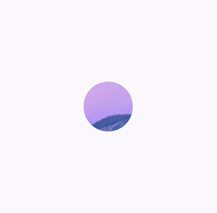 ::: ::::